Brand identity
Northside Bozeman brand guidelines
Logos, colors, and type for anyone making something for the Northside. Click any color value to copy it.
01
Logos
Four files, one family. Use the biggest one that fits. SVG scales to any size, including print.
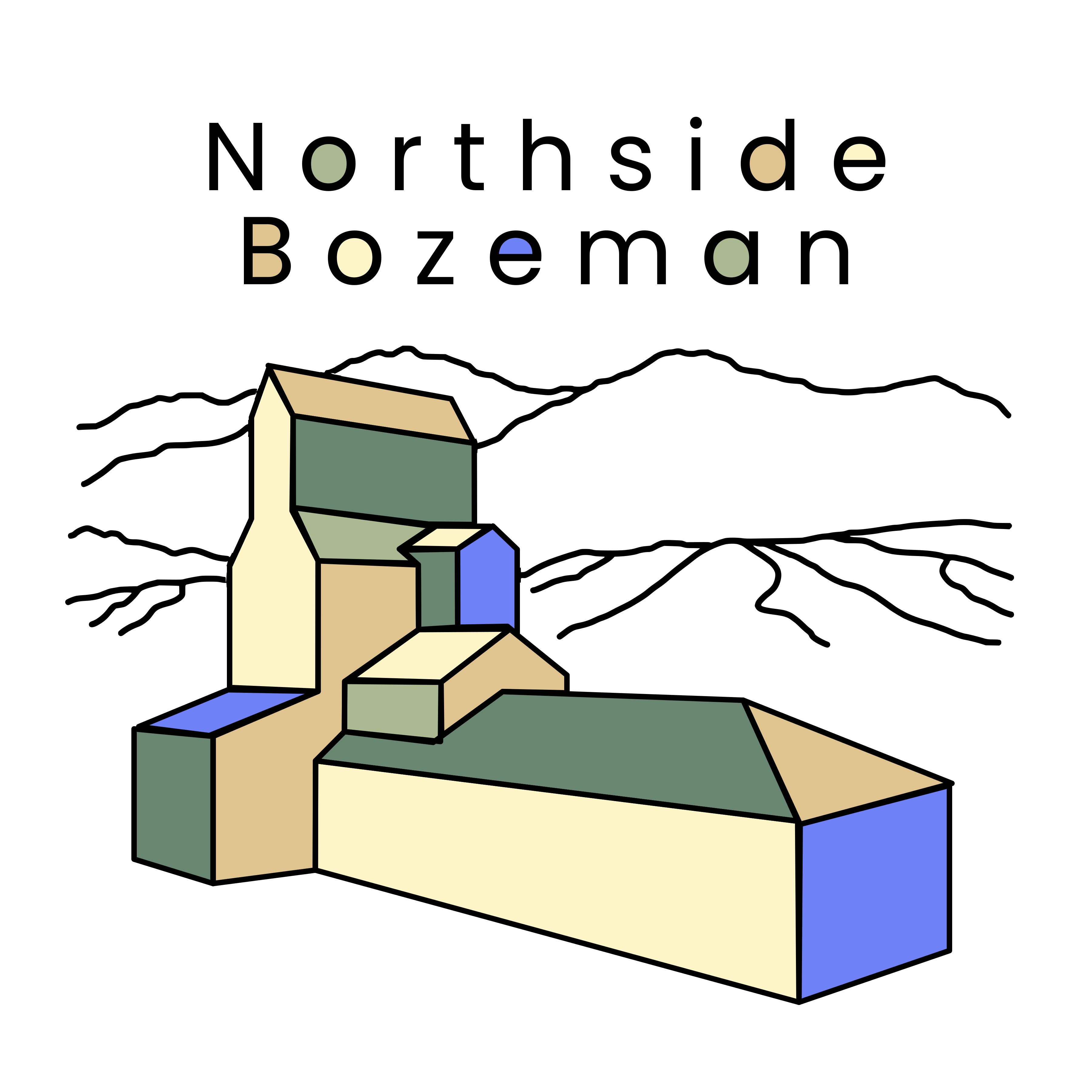
Full logo
Wordmark and grain elevator. Use it wherever there is room: posters, banners, signage, and print.
Minimum size
240px wide on screen
Mark
The elevator and mountains, without the wordmark. Use it beside the name, including the site header.
Minimum size
96px wide on screen
Black mono
The full logo in black. Use it on the blue footer. Forest and cream both fail on that blue.
Minimum size
160px wide on screen
Cream mono
The full logo in cream, for a black ground. Not for the blue footer.
Minimum size
120px wide on screen
Do
- Place the full logo and the mark on cream or white. Use the black mono logo on the blue footer.
- Keep clear space around the logo equal to the height of the “B” in BOZEMAN.
- Scale proportionally, and use the SVG files from this page.
Don’t
- Don’t put the full logo, the mark, or the cream mono logo on the blue footer. Don’t set white, cream, or yellow text there.
- Don’t recolor, stretch, rotate, outline, or add shadows.
- Don’t retype the wordmark in a font. The lettering is custom.
02
Colors
Cream is the page. Black is the type. Forest is the brand colour for links and buttons. Yellow, amber, tan, chartreuse, powder blue, light sage, and khaki are fills and rules, not text on cream or white. Click a swatch or any value to copy it.
Palette
Fill
Blue
Footer background. Under 3:1 on the page, so not for text. A map pin may use it with a black ring. Black text on the footer. Never white, cream, or yellow text on blue.
- HEX
- RGB
- CSS
Surface
White
Cards, header, and inputs. Components call this surface.
- HEX
- RGB
- CSS
Fill
Yellow
Badges and the hairline under the header bar. Black text on yellow. Yellow text only on forest or slate.
- HEX
- RGB
- CSS
Text
Black
Body text, headings, and footer text. Components call this ink.
- HEX
- RGB
- CSS
Fill
Amber
Decorative bands and rules. Not text on cream or white.
- HEX
- RGB
- CSS
Fill
Light gray
Quiet fills. Not text on cream or white.
- HEX
- RGB
- CSS
Fill
Golden brown
Under 3:1 on the page background, so not for text or pins there. Never white text on golden brown.
- HEX
- RGB
- CSS
Fill
Tan
Decorative fills. Not text on cream or white.
- HEX
- RGB
- CSS
Background
Cream
Page background, soft ivory. The canvas everything else sits on.
- HEX
- RGB
- CSS
Secondary text
Medium gray
Ledes, captions, and metadata, on cream or white only. Components call this muted.
- HEX
- RGB
- CSS
Text
Slate blue
Secondary labels and the outline button. White or cream text when the button fills.
- HEX
- RGB
- CSS
Hairline
Khaki
Borders and dividers. Components call this line. Not text.
- HEX
- RGB
- CSS
Fill
Olive brown
Decorative fills. Too light for body text on cream.
- HEX
- RGB
- CSS
Fill
Sage
Decorative bands. Not body text on cream.
- HEX
- RGB
- CSS
Brand
Forest
Links, primary buttons, and the focus ring. White or cream text on forest.
- HEX
- RGB
- CSS
Fill
Light sage
Decorative fills. Not text on cream or white.
- HEX
- RGB
- CSS
Fill
Powder blue
Decorative fills. Not text on cream or white.
- HEX
- RGB
- CSS
Fill
Chartreuse
Decorative fills. Not text on cream or white.
- HEX
- RGB
- CSS
Functional & supporting
Text
Ink
Alias of black. Body copy, headings, and footer text.
- HEX
- RGB
- CSS
Surface
Surface
Alias of white. Cards, header, inputs, and text on forest buttons.
- HEX
- RGB
- CSS
Secondary text
Muted
Alias of medium gray. Secondary text on cream or white only.
- HEX
- RGB
- CSS
Borders
Line
Alias of khaki. Hairlines and card borders. Not text.
- HEX
- RGB
- CSS
Hover
Forest deep
Hover and pressed state for forest buttons. White text still passes.
- HEX
- RGB
- CSS
Error
Error
Error and alert text only. Dark red, not a brand colour.
- HEX
- RGB
- CSS
03
Accessible pairings
WCAG contrast for common combinations. Body text needs AA (4.5:1). “AA Large” is only for text at least 24px, or 19px bold.
| Sample | Use | Ratio | Rating |
|---|---|---|---|
| Northside | Body text and headings#000000 on #F6F0DF | 18.448:1 | AAA |
| Northside | Secondary text on cream#6F6D6B on #F6F0DF | 4.526:1 | AA |
| Northside | Secondary text on white#6F6D6B on #FFFFFF | 5.153:1 | AA |
| Northside | Links and brand text#446155 on #F6F0DF | 5.976:1 | AA |
| Northside | Slate text#58687D on #F6F0DF | 4.998:1 | AA |
| Northside | Primary button#FFFFFF on #446155 | 6.803:1 | AA |
| Northside | Cream text on forest#F6F0DF on #446155 | 5.976:1 | AA |
| Northside | Primary button hover#FFFFFF on #334940 | 9.687:1 | AAA |
| Northside | Secondary button hover#FFFFFF on #58687D | 5.689:1 | AA |
| Northside | Badge text#000000 on #FCED66 | 17.445:1 | AAA |
| Northside | Footer text, links, and focus ring#000000 on #6F81F7 | 6.159:1 | AA |
| Northside | White text on black#FFFFFF on #000000 | 21.000:1 | AAA |
| Northside | Cream text on black#F6F0DF on #000000 | 18.448:1 | AAA |
| Northside | Error text#9B1C1C on #F6F0DF | 7.160:1 | AAA |
| Northside | Yellow text on forest#FCED66 on #446155 | 5.651:1 | AA |
| Northside | Yellow text on slate#FCED66 on #58687D | 4.726:1 | AA |
| Northside | Blue on the page — under 3:1#6F81F7 on #F6F0DF | 2.995:1 | Fail |
| Northside | Golden brown on the page — under 3:1#B6812B on #F6F0DF | 2.993:1 | Fail |
| Northside | Never: white text on blue#FFFFFF on #6F81F7 | 3.410:1 | AA Large |
| Northside | Never: cream text on blue#F6F0DF on #6F81F7 | 2.995:1 | Fail |
| Northside | Never: yellow text on blue#FCED66 on #6F81F7 | 2.832:1 | Fail |
| Northside | Never: white text on golden brown#FFFFFF on #B6812B | 3.407:1 | AA Large |
| Northside | Never: yellow text on cream#FCED66 on #F6F0DF | 1.058:1 | Fail |
04
Typography
Poppins for headings, body, and kickers. It is self-hosted with Fontsource. The logo lettering is still custom and is not this font.
Headings · Poppins 500–700
From Lager to Legacy
Historic Brewery District
Bozeman, Montana
Body · Poppins 400 / 600
Artists, makers, brewers, and neighbors who keep the Northside local. Body copy is 16–18px, with a line height around 1.6.
Kicker · uppercase, tracked
05
Buttons & details
Square corners, flat fills, and a forest bar with a yellow hairline, like the site header.
Signature rule: 4px forest + 1px yellow.
06
Voice
Neighborly
Write like you’re talking over the fence. Say “we” and “our block,” not “stakeholders.”
Rooted
Lean on real history: the brewery, the rail line, the grain elevators. Name real places and people.
Plainspoken
Short sentences and concrete details. Skip the marketing superlatives.